Sugar plz
client_二沙堂 ; project_interior(2026:03 ; interior design_ALBUM RIVERS
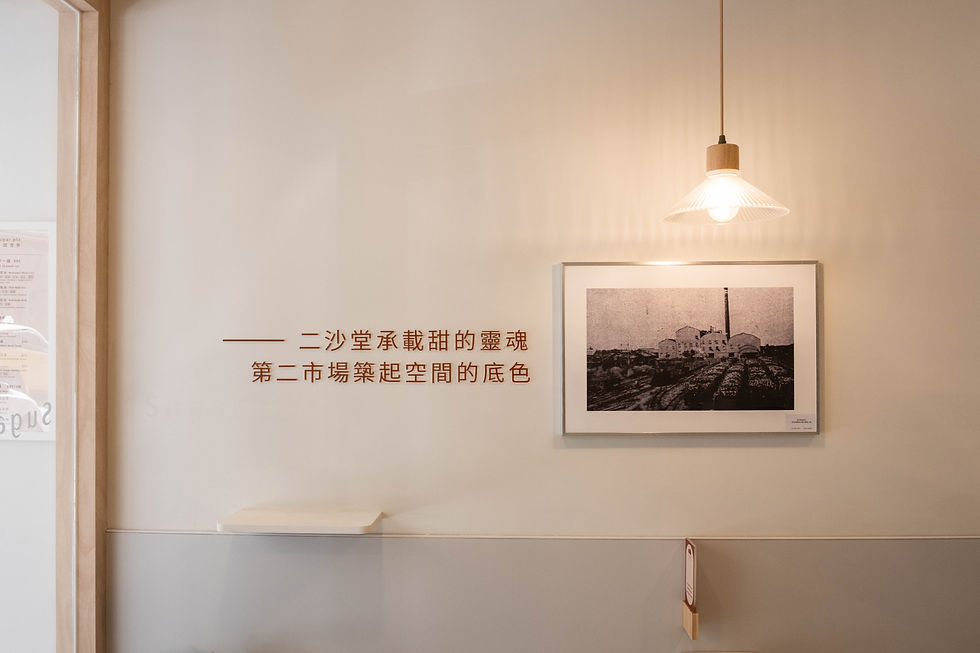
空間,是品牌調性的立體化
二沙堂想傳達的是「簡單、清爽、健康」
那麼空間就不能比甜品更搶戲
於是我們讓空間退到一步的距離
白、米、灰,是整體的底色
不搶走任何一碗湯圓的存在感
讓人一踏進來,可以在這裡輕鬆待著
木質帶來不做作的溫度
在櫃檯使用紅磚堆砌,讓不規則的紋路
呼應周遭市場的人情味與情懷
視覺上沒有需要被解讀的複雜符號
因為二沙堂本來就不複雜
它是一間讓忙碌的人不用做太多選擇的地方
空間要做的,是讓這件事從氛圍上被感受
只要走進來,就能找回生活裡最簡單的滿足
Space is the three-dimensional expression of a brand.
For Sugar Plz, the message is different: simple, refreshing, and wholesome.
So the space steps back, letting the desserts remain the focus.
White, beige, and grey form the base of the interior,
paired with warm wood to create a calm and natural atmosphere.
At the counter, stacked red bricks introduce a subtle texture—
a quiet echo of the surrounding market and its everyday warmth.
There are no complicated symbols here.
Because Sugar Plz itself isn’t complicated.
It’s simply a place where busy people can pause
and rediscover how satisfying simplicity can be.